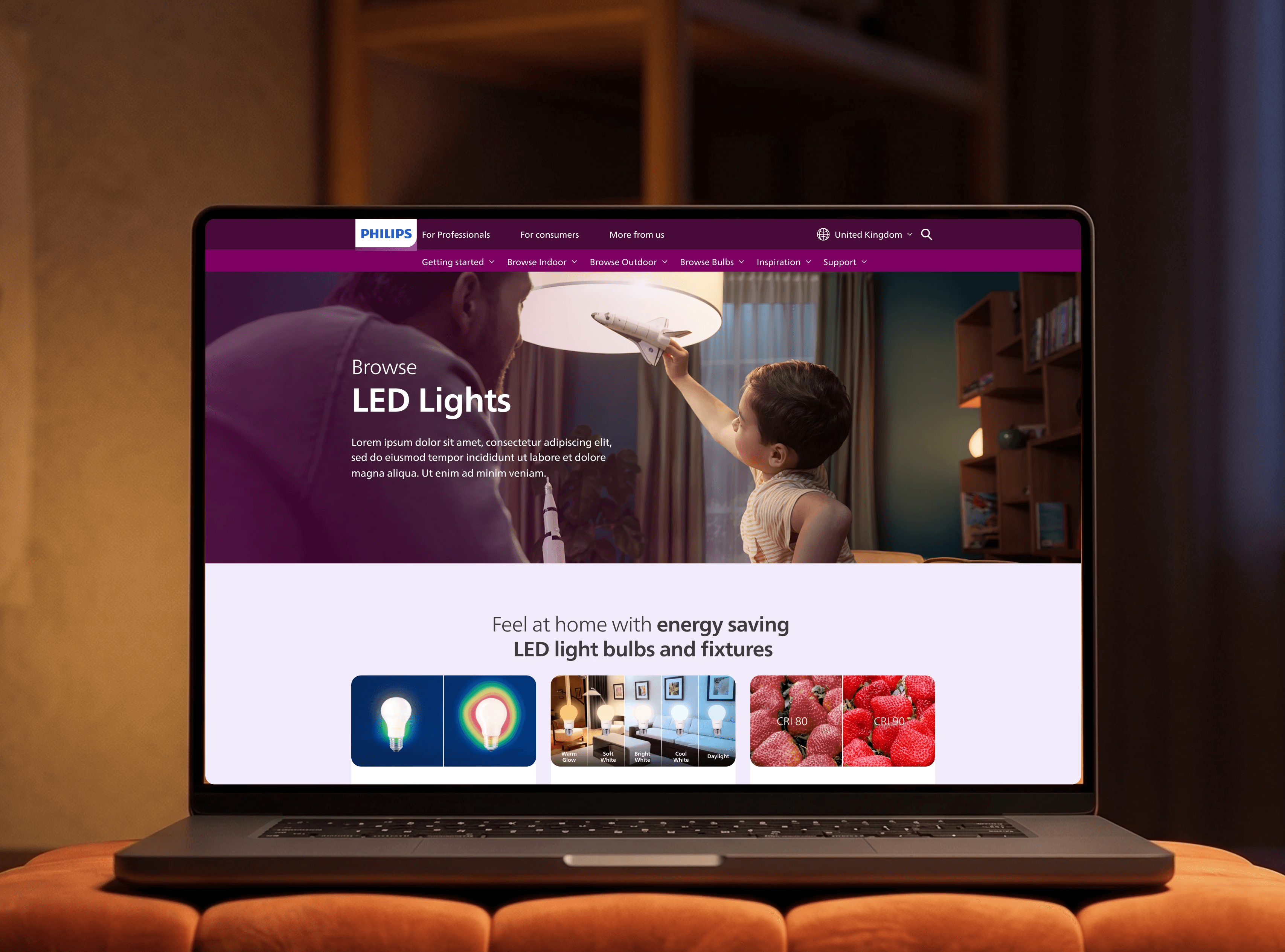
Redesigning the Philips lighting website's user experience, site structure, and information hierarchy.
Introduction
The Philips Lighting consumer website is a global leader, selling light products to customers in 50+ markets.
The ultimate objective was to transition the website from a standard product catalog into an intuitive, user-friendly platform that guides consumers seamlessly from initial inspiration to final purchase.
Client
Signify / Philips Lighting B2C
Agency
dentsu Creative Amsterdam
year
2024
research + strategy
The focus was to identify solutions that offered high impact for the consumer, or were low-hanging fruit for the website.
Following an extensive UX audit and primary research, we mapped out the key user pain points. While the initial website issues were flagged by the strategy team, I took ownership of the project from that point forward conducting the new sitemap, page information architecture, and final UX design.
1.
The legacy site architecture catered strictly to industry experts, leaving everyday consumers confused and frustrated, alongside broken and duplicate pages.
2.
Simplicity:
Empower shoppers to seamlessly discover and select products based on their specific needs.
Dense technical jargon made it incredibly difficult for non-technical users to make self-assured purchasing choices.
3.
Inspiration:
Ground the digital journey in real-life contexts to spark creativity and reinforce buyer confidence.
Standard, dry product catalogs failed to help users visualize how different lighting solutions would actually look or feel in their spaces.
Solution:
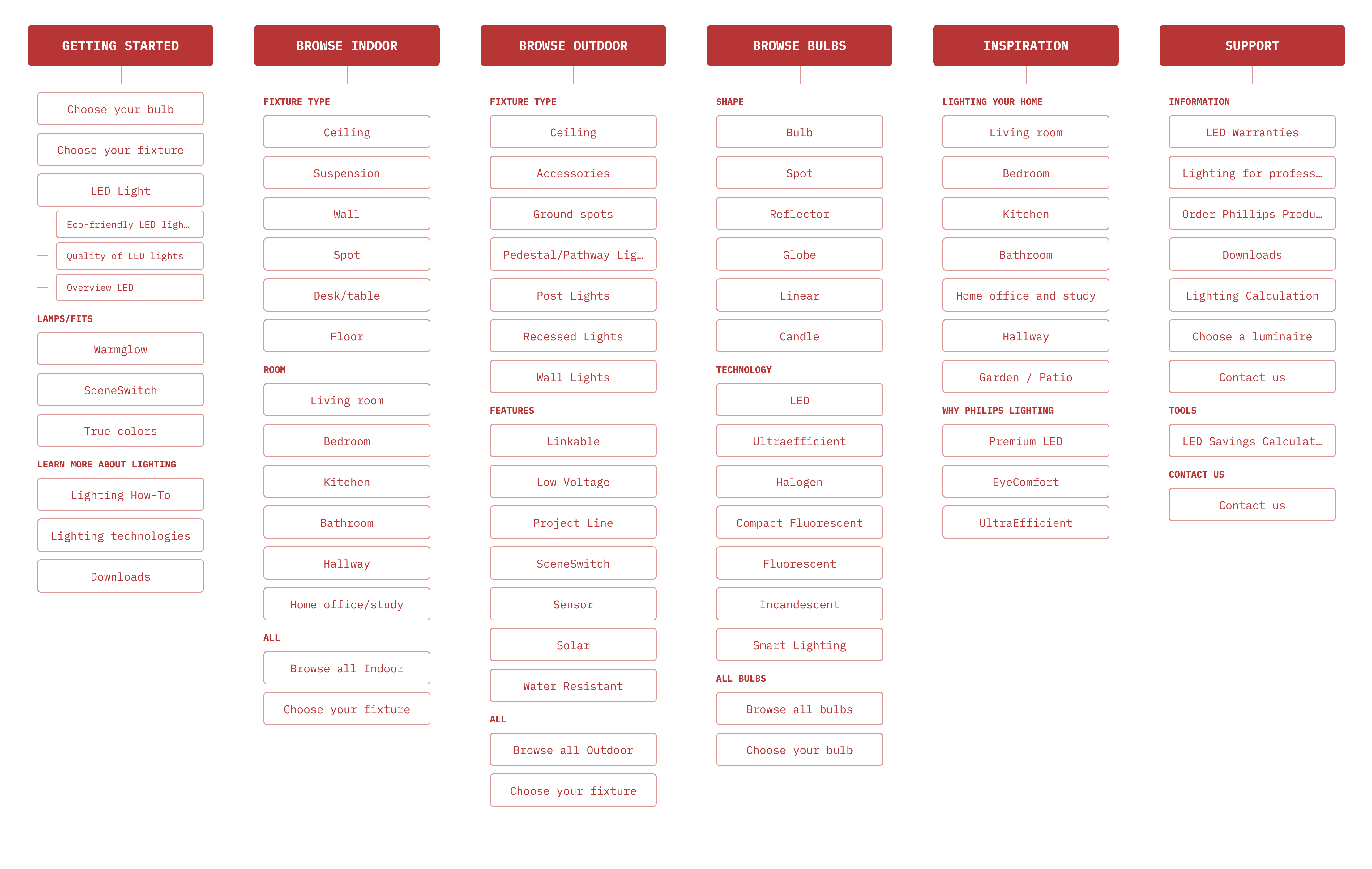
A completely overhauled navigation structure designed intuitively around the consumer's real-world shopping habits.
Solution:
Curated, demystified content paths that deliver clear, accessible product education to users who are completely new to LED lighting.
Solution:
A familiar, magazine-style editorial layout that blends lifestyle aesthetics with product features, allowing users to easily imagine the potential of Philips LED in their own homes.
navigation
The navigation structure came down to two things:
High-level categorization:
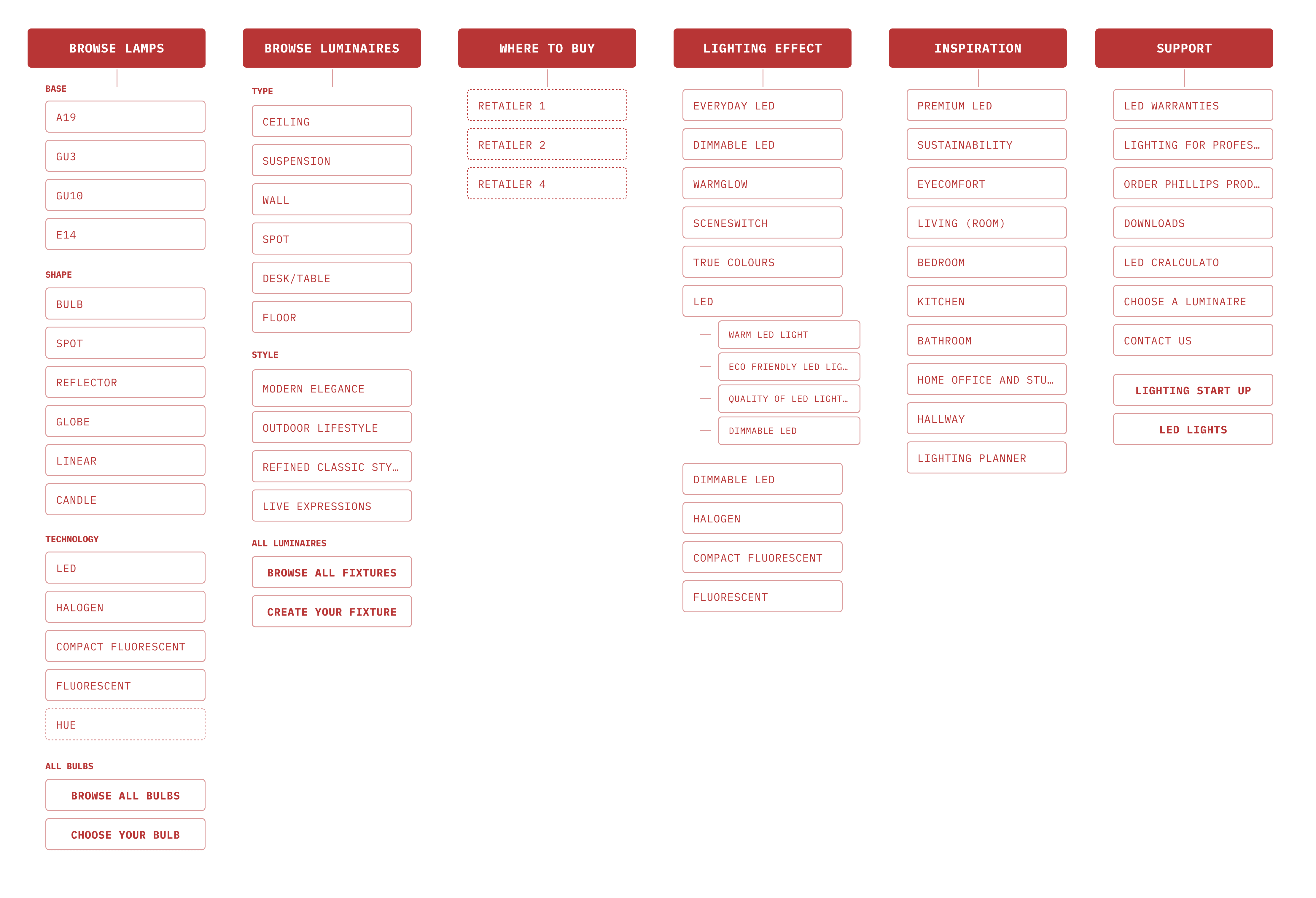
We anchored the site in an industry-standard structure, using "Indoor," "Outdoor," and "Bulbs" as our primary navigation pillars. To support the full customer journey, we also integrated dedicated paths for absolute beginners, design inspiration, and customer support.
Standardizing terminology
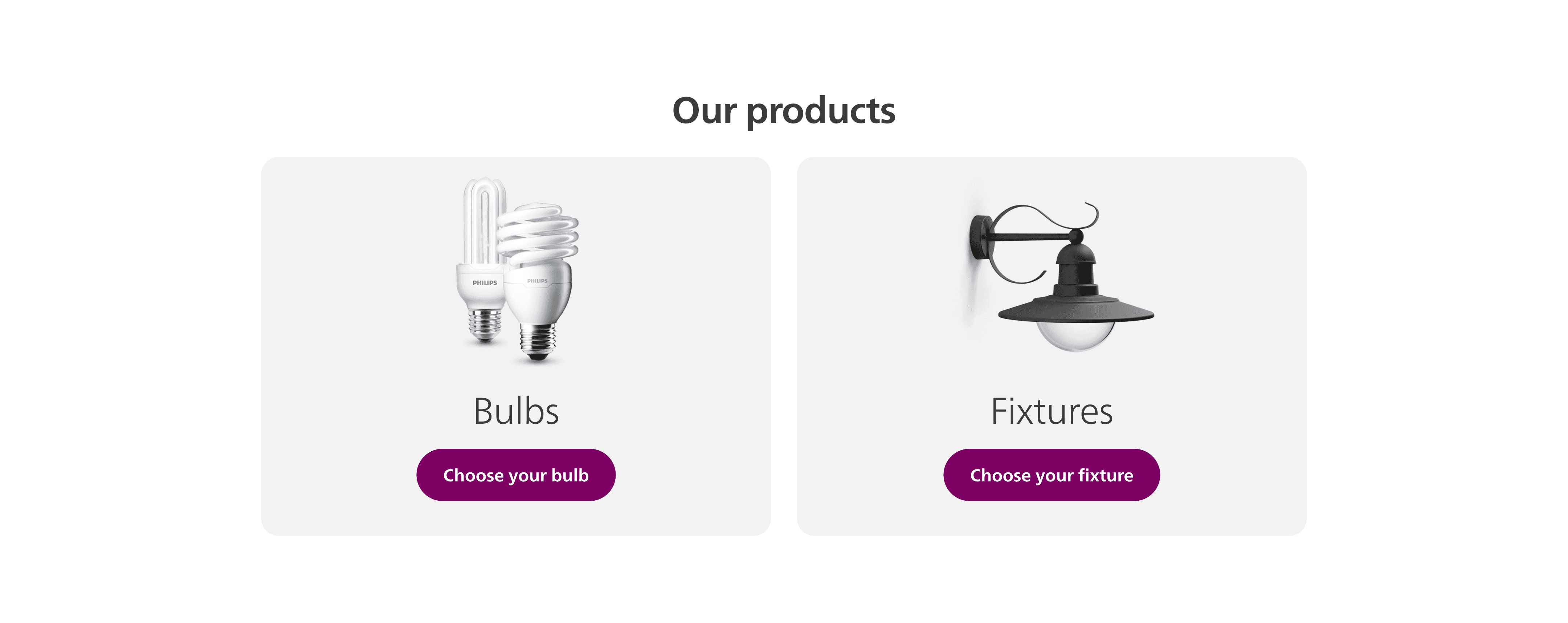
User research revealed major confusion around industry jargon like lamps, luminaires, bulbs, and fixtures. To resolve this, we tested the terminology and standardized on "Bulbs" and "Fixtures", which resonated most clearly with everyday shoppers.
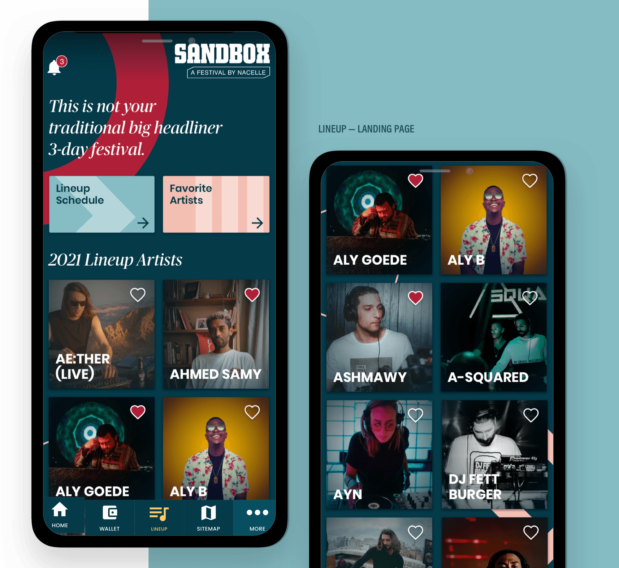
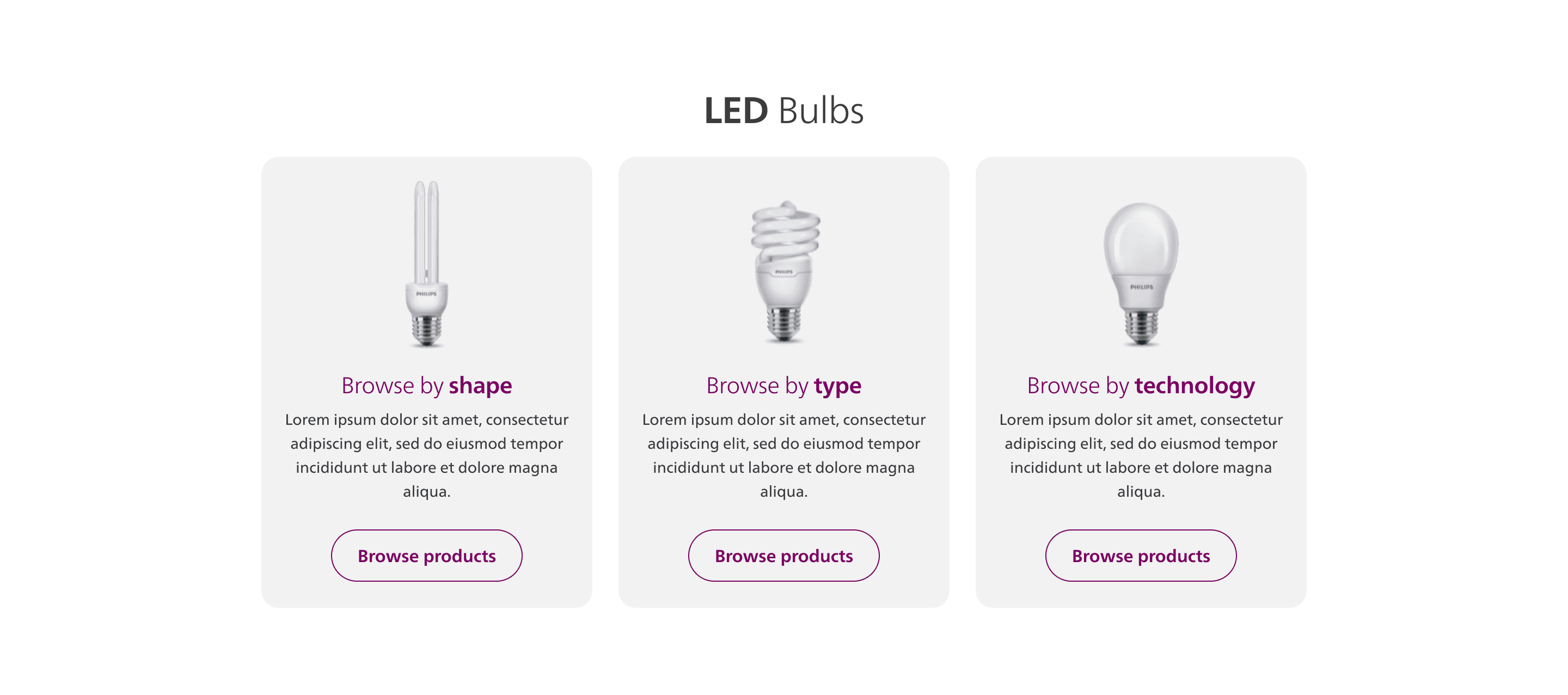
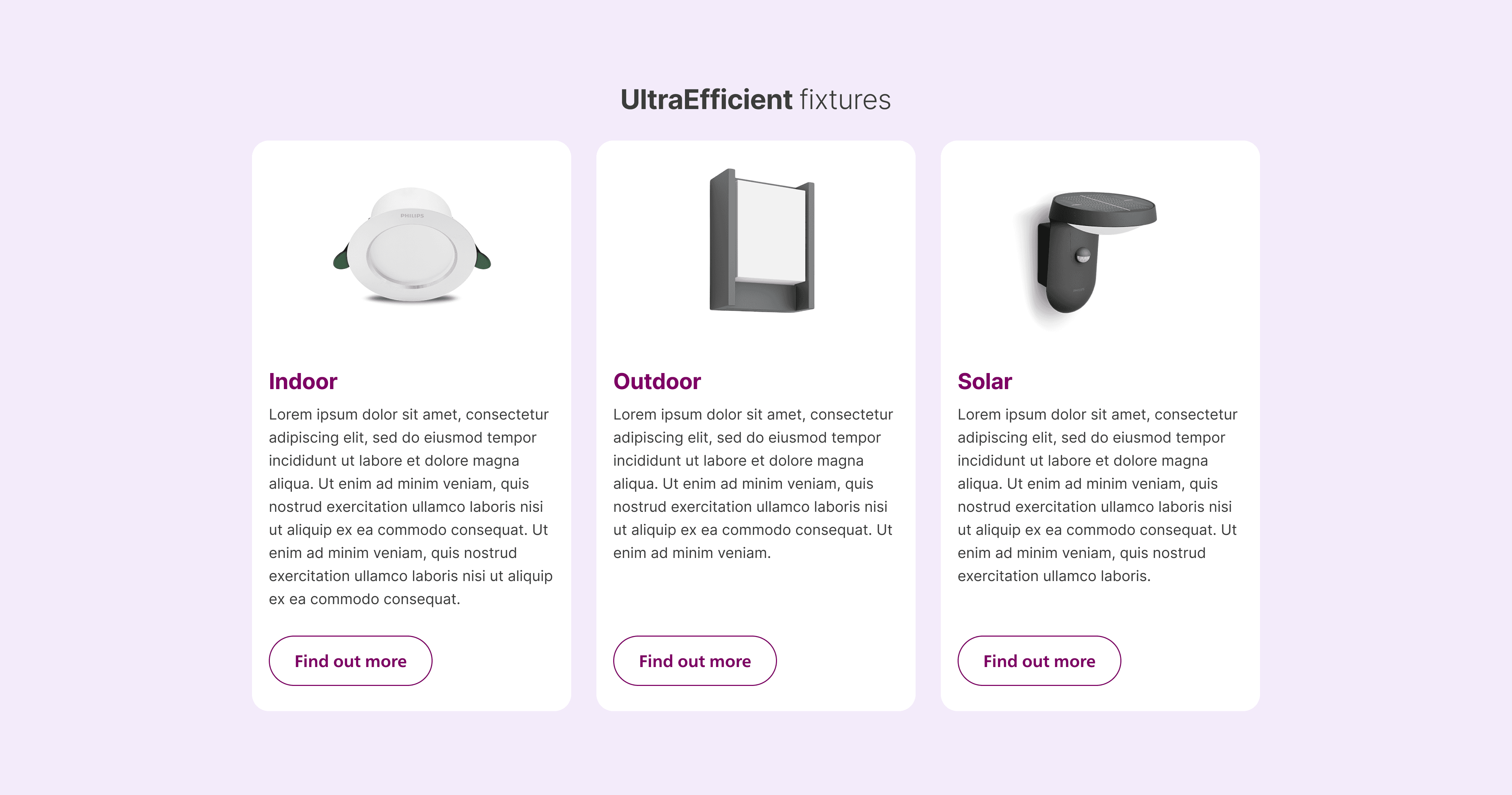
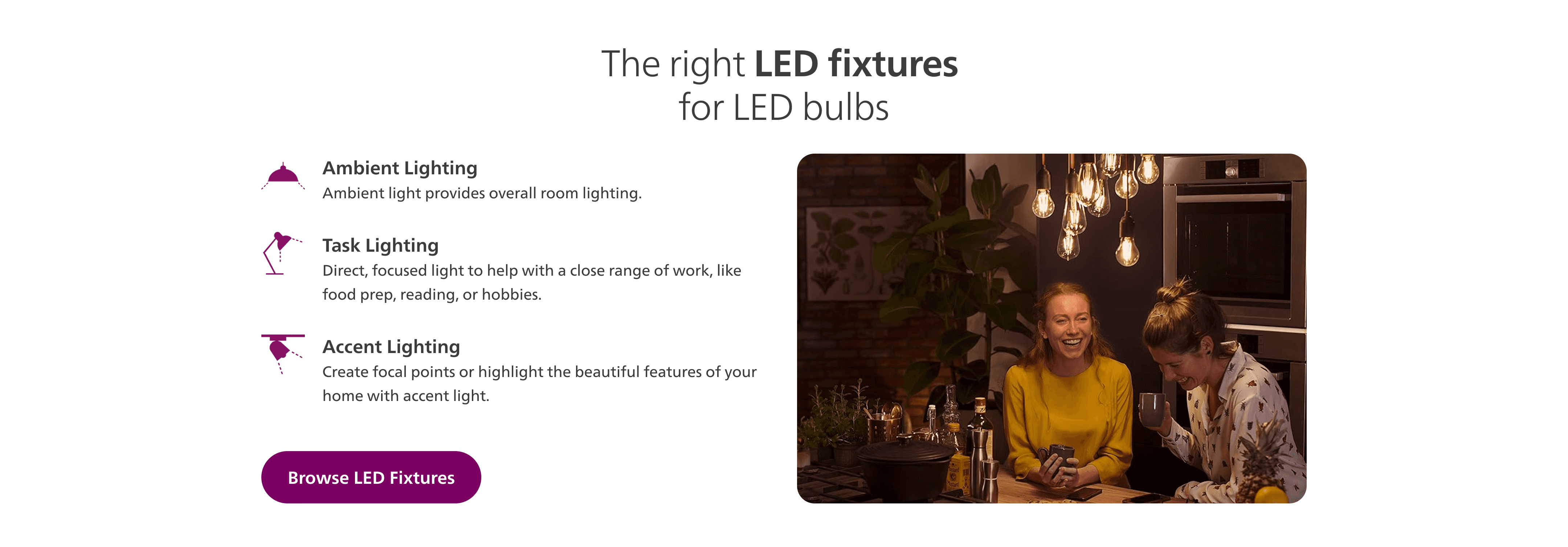
I introduced navigational components to seamlessly guide consumers toward their end goals on editorial pages.
These elements visually translate our sitemap categories into interactive touchpoints as the user scrolls, maintaining clear orientation throughout the journey.
information hierarchy
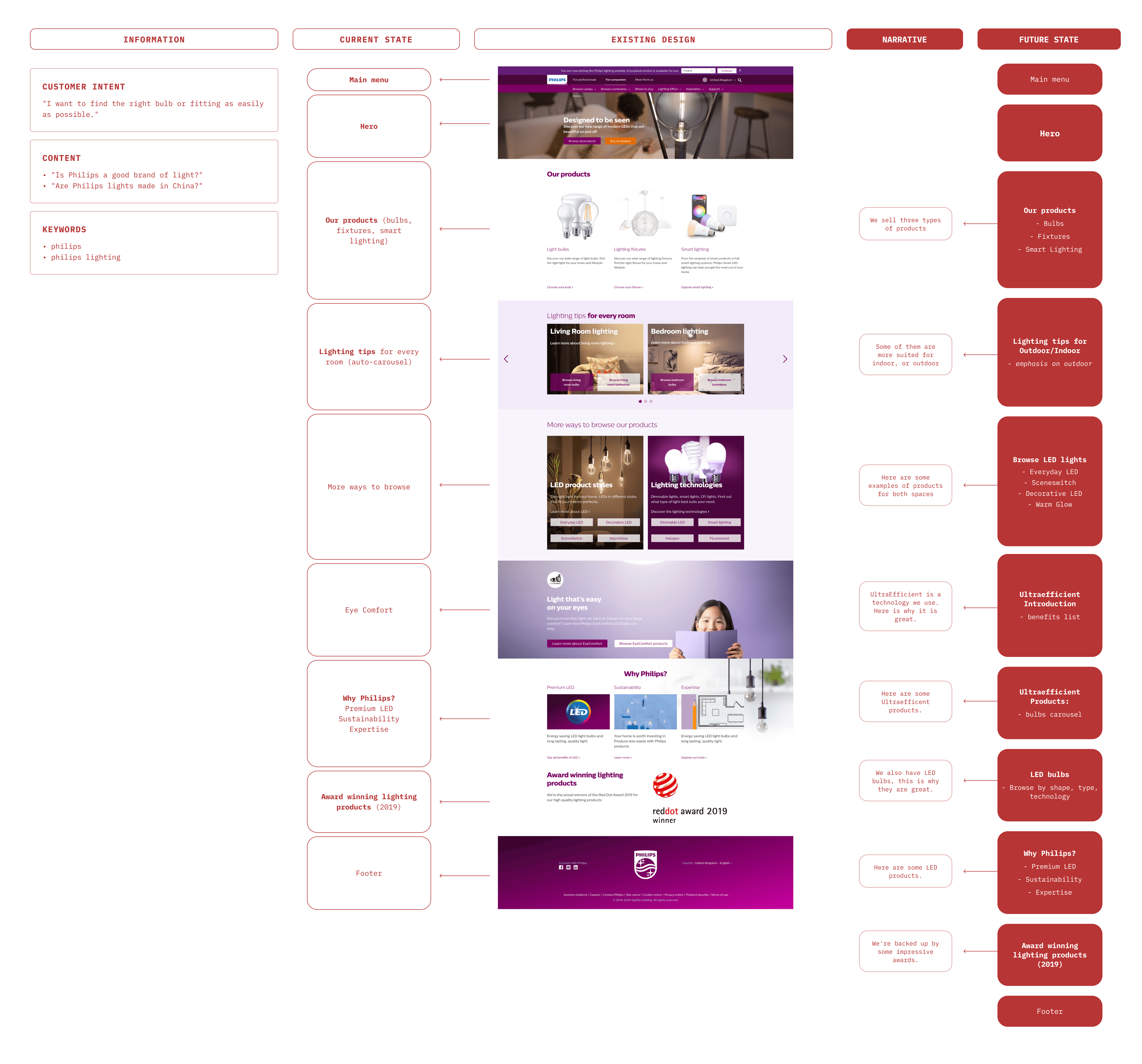
I created a list of priority guides to guide the information hierarchy in every editorial page.
These guides were shaped by combining customer intent, frequently asked questions, SEO data on common search queries, and a natural storytelling flow for the page.
design
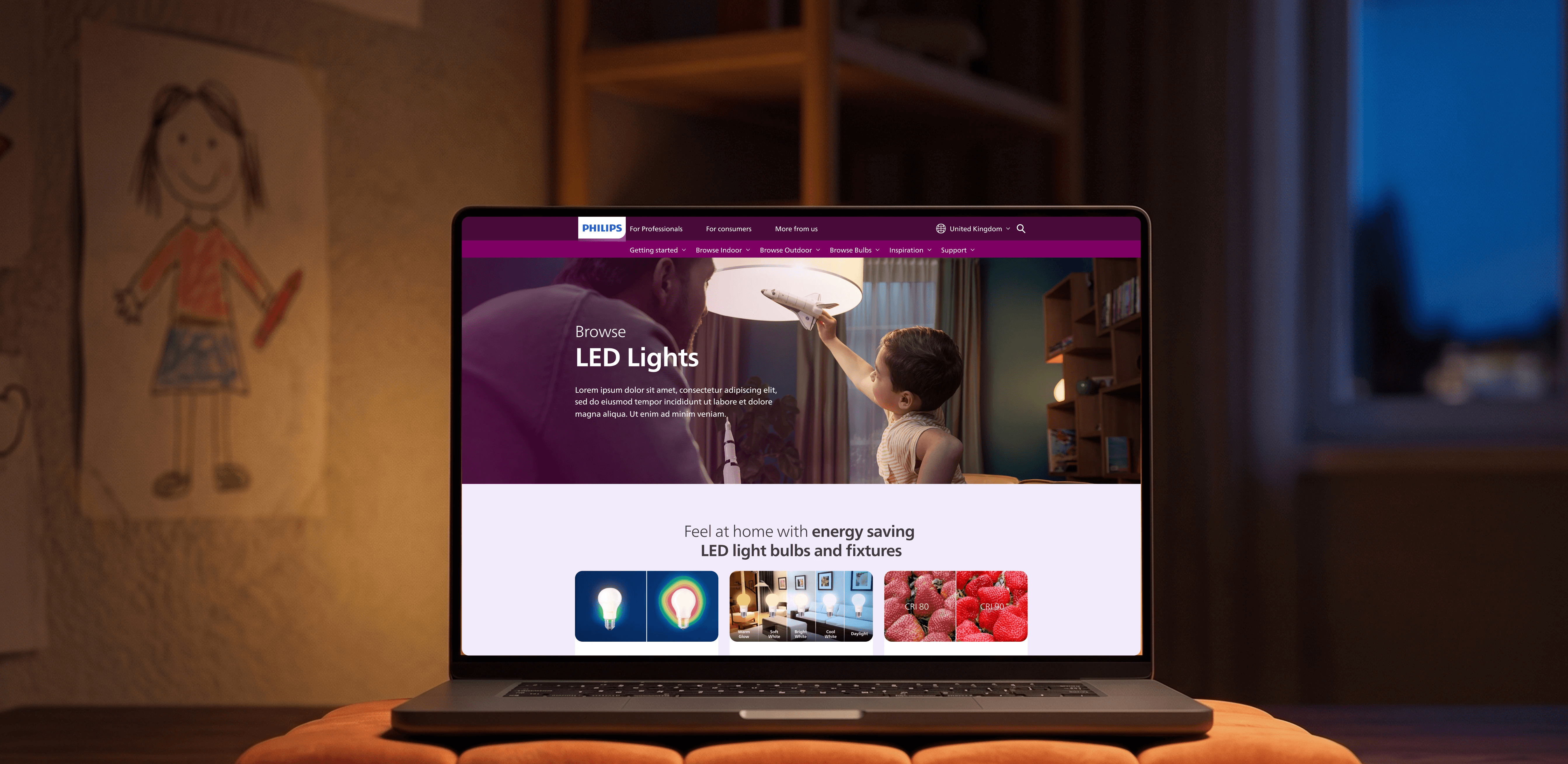
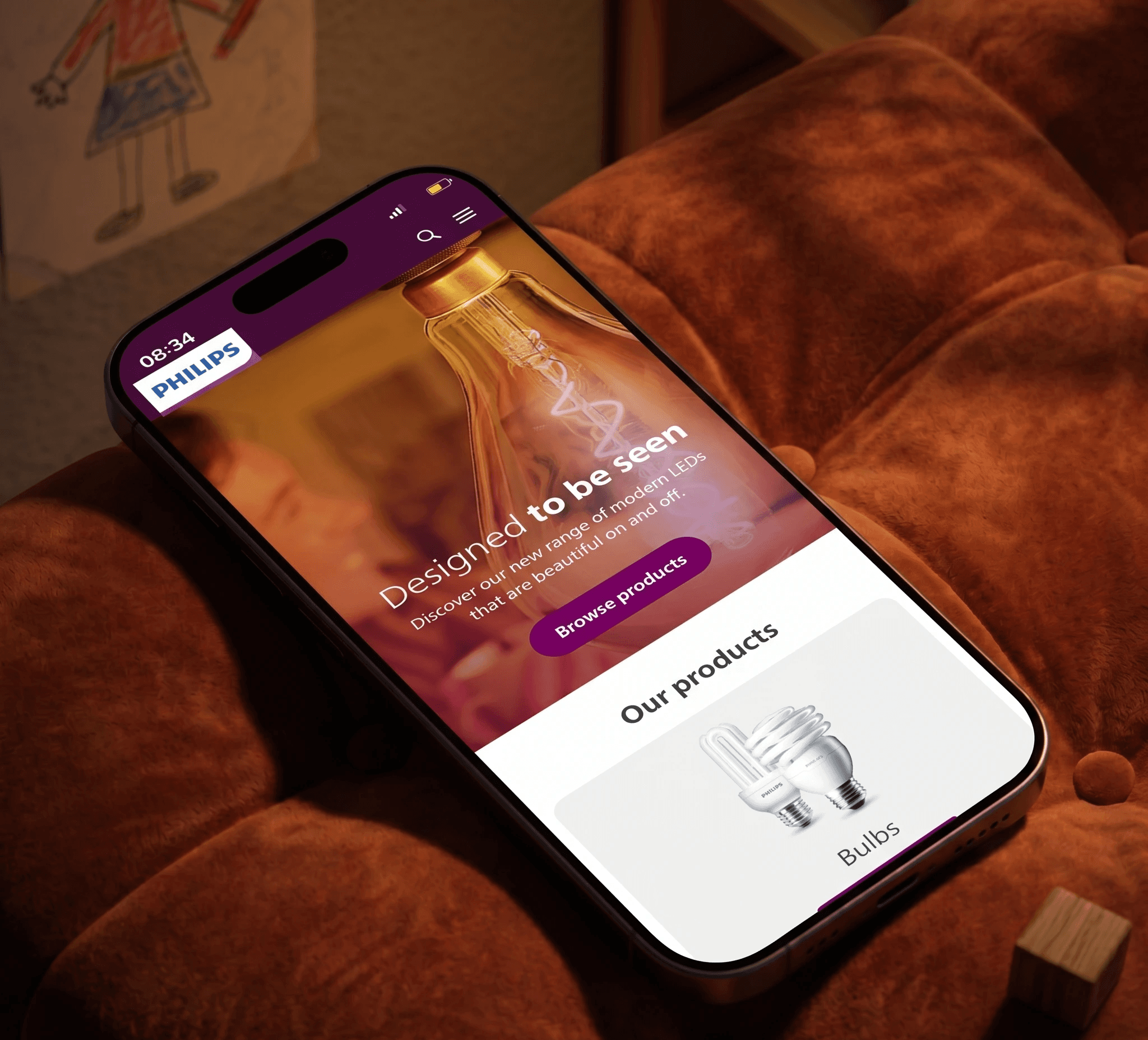
Inspirational lifestyle visuals were integrated into the final UI to help consumers easily picture products within their own homes.
Although the project was restricted to existing components within the global design system, the team, in collaboration with Dentsu Creative Poland, strategically leveraged rich visuals and engaging card layouts to make the pages feel more dynamic.